Analyse Cosmx data in Napari-SpatialData#
This tutorial shows how to load and analyze Cosmx data with the Napari-SpatialData plugin.
Import packages and data#
There are two options to install napari-spatialdata:
(1) Install napari
(2a) Run pip install napari-spatialdata
or,
(2b) Clone this repo and run pip install -e .
%matplotlib inline
import matplotlib.pyplot as plt
from napari_spatialdata import Interactive
from spatialdata import SpatialData
import squidpy as sq
import scanpy as sc

plt.rcParams['figure.figsize'] = (20, 20)
Please download the CosMx raw data from https://brukerspatialbiology.com/products/cosmx-spatial-molecular-imager/ffpe-dataset/nsclc-ffpe-dataset/, parse it using spatialdata_io and save it to the SpatialData Zarr format (you can for instance use this script).
We will load the dataset from the filepath and create a spatialdata.SpatialData object. We’ll use this object with the class Interactive to visualise this dataset in Napari.
FILE_PATH = "tutorial_data/nanostring_data/data.zarr" # Path to the data file. Change if your data is stored in a different location.
sdata = SpatialData.read(FILE_PATH)
Visualise in napari#
To make it easier to analyse our data, we will filter the SpatialData object by the coordinate system “1”.
sdata = sdata.filter_by_coordinate_system("1")
adata = sdata.table
Then, we make the variable names unique using the method anndata.var_names_make_unique. We obtain the mitochondrial genes using their names prefixed with “mt-”. We calculate the quality control metrics on the anndata.AnnData using scanpy.pp.calculate_qc_metrics.
adata.var_names_make_unique()
adata.var["mt"] = adata.var_names.str.startswith("mt-")
sc.pp.calculate_qc_metrics(adata, qc_vars=["mt"], inplace=True)
The scikit-misc package could be required for highly variable genes identification.
# !pip install scikit-misc
Annotate the highly variable genes based on the count data by using scanpy.pp.highly_variable_genes with flavor=”seurat_v3”. Normalize counts per cell using scanpy.pp.normalize_total.
Logarithmize, do principal component analysis, compute a neighborhood graph of the observations using scanpy.pp.log1p, scanpy.pp.pca and scanpy.pp.neighbors respectively.
Use scanpy.tl.umap to embed the neighborhood graph of the data and cluster the cells into subgroups employing scanpy.tl.leiden.
adata.layers["counts"] = adata.X.copy()
sc.pp.highly_variable_genes(adata, flavor="seurat_v3", n_top_genes=4000)
sc.pp.normalize_total(adata, inplace=True)
sc.pp.log1p(adata)
sc.pp.pca(adata)
sc.pp.neighbors(adata)
sc.tl.umap(adata)
sc.tl.leiden(adata)
Next, we will use the Scatter Widget offered by Napari SpatialData to visualise the UMAP coordinates.
First, we instantiate the Interactive class with our spatialdata.SpatialData object, and view it in Napari.
interactive = Interactive(sdata)
interactive.run()
plt.imshow(interactive.screenshot())
plt.axis('off')
(-0.5, 1678.5, 1199.5, -0.5)

We select the coordinate system “1” and load the elements “1_image” and “1_labels” into the viewer.
plt.imshow(interactive.screenshot())
plt.axis('off')
(-0.5, 1678.5, 1199.5, -0.5)

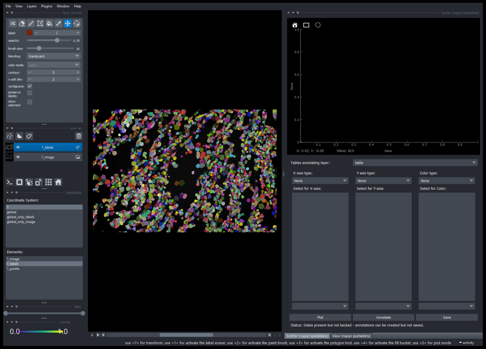
Select “1_labels” in the list of layers. Then, we open the “Scatter” Widget by using the menu bar and going to Plugins > napari-spatialdata > Scatter. This loads the AnnData object associated with that layer into the “Scatter” Widget.
plt.imshow(interactive.screenshot())
plt.axis('off')
(-0.5, 1678.5, 1199.5, -0.5)
Now, we can pick specific x-axis, y-axis and color values to visualise in the scatterplot. In the example below, we’re visualising the UMAP (Uniform Manifold Approximation and Projection) coordinates (from obsm) of two different axes and coloring it with clusters created using the Leiden algorithm (from obs). Use the “Plot” button to show the plot after you make the selections.
plt.imshow(interactive.screenshot())
plt.axis('off')
(-0.5, 1678.5, 1199.5, -0.5)

After plotting, it is possible to interactively select clusters and export it to AnnData.
In the example below, we used the lasso tool to select the left most cluster (value of 11). We can export it into AnnData by clicking on the “Annotate” button. A new dialog will open to specify the name of your new annotation, here we will call it ‘my_annotation’.
plt.imshow(interactive.screenshot())
plt.axis('off')
(-0.5, 1678.5, 1199.5, -0.5)

We can now use our new annotation ‘my_annotation’ in the Scatter Widget directly. In this example we will use it as color.
plt.imshow(interactive.screenshot())
plt.axis('off')
(-0.5, 1678.5, 1199.5, -0.5)

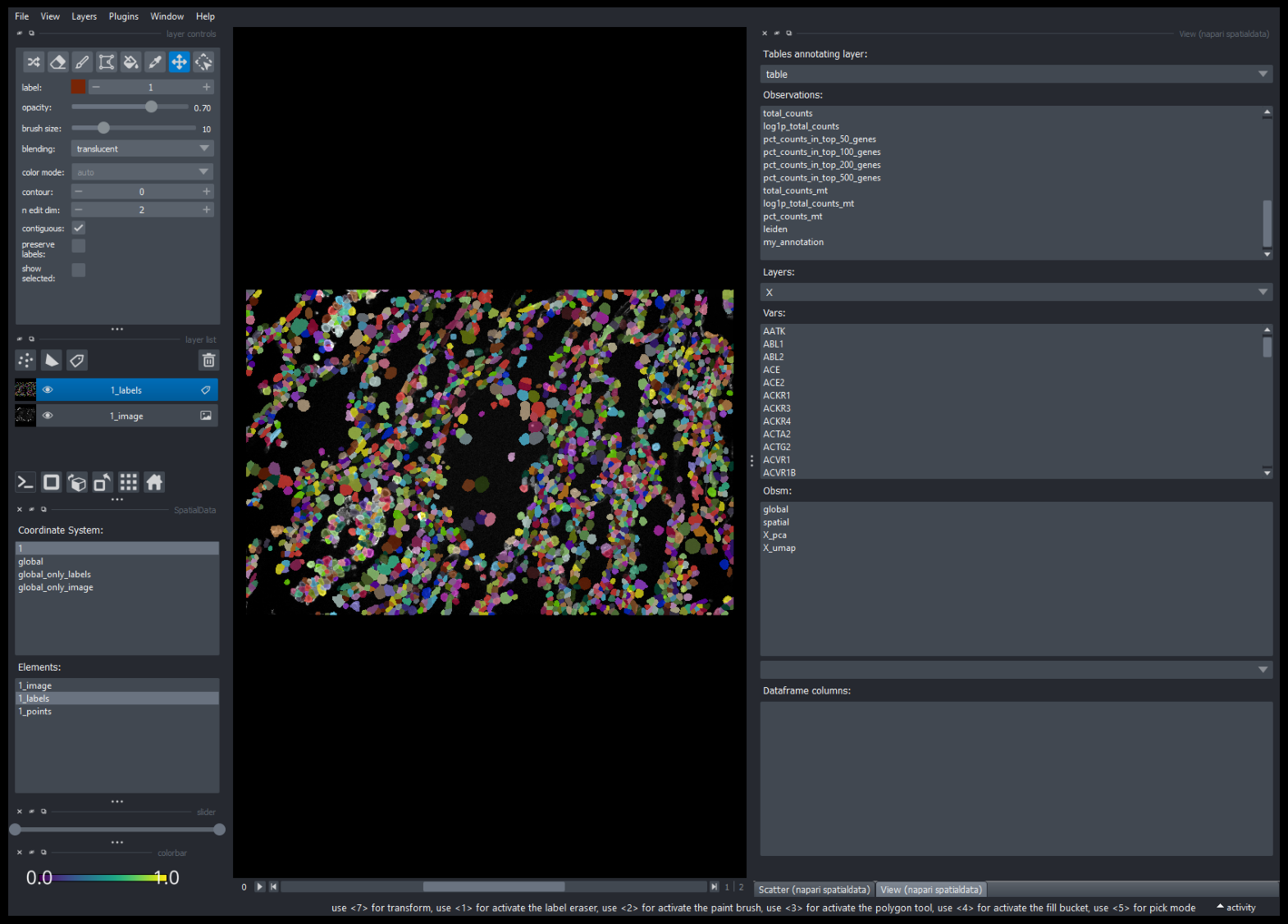
We can also view the selected points with the View widget. Close the Scatter Widget and from the menu bar, go to Plugins > napari-spatialdata > View. You should be able to observe “my_annotation” under “Observations:”. This is selected points we exported in the previous step.
plt.imshow(interactive.screenshot())
plt.axis('off')
(-0.5, 1678.5, 1199.5, -0.5)
Double clicking on “my_annotation” loads it as a layer in the Napari viewer.
plt.imshow(interactive.screenshot())
plt.axis('off')
(-0.5, 1678.5, 1199.5, -0.5)
