
Technology focus: Xenium#
This notebook will present an overview of the plotting functionalities of the spatialdata framework, in the context of a Xenium dataset.
Other notebooks, focused on data manipualtion, are also available for Xenium data:
Alignment of a Xenium and Visium datasets (this is one of the reproducibility notebooks for the analysis of our paper) notebook
Workflow showing saving annotations in Xenium Explorer and accessing them in SpaitalData, and viceversa notebook. Tutorial from Quentin Blampey.
%load_ext jupyter_black
%load_ext autoreload
%autoreload 2
Loading the data#
A reader for Xenium data is available in spatialdata-io. We used it to parse and convert to Zarr a Xenium dataset of Human Lung Cancer.
Information regarding data licensing and attribution for the dataset listed above is also available at: https://github.com/scverse/spatialdata-notebooks/tree/main/datasets.
You can download the data from the link above, or from this convenience python script and convert it to spatialdata format with this script, rename the .zarr store to xenium.zarr and place it in the current folder (in alternatively you can use symlinks to make the data visible).
The dataset used in this notebook is the latest Xenium Multimodal Cell Segmentation extension of the Xenium technology, available for data processed using Xenium Analyzer version 2.0.0 and when Cell Segmentation Kit was used. Nevertheless, the xenium() reader supports all the Xenium versions.
xenium_path = "./xenium_2.0.0.zarr"
%%time
import spatialdata as sd
import spatialdata_plot  # noqa: F401

sdata = sd.read_zarr(xenium_path)
sdata
CPU times: user 2.34 s, sys: 448 ms, total: 2.79 s
Wall time: 3.2 s
SpatialData object, with associated Zarr store: /Users/macbook/embl/projects/basel/spatialdata-data-converter/dependencies/spatialdata-sandbox/xenium_2.0.0_io/data.zarr
├── Images
│     ├── 'he_image': DataTree[cyx] (3, 45087, 11580), (3, 22543, 5790), (3, 11271, 2895), (3, 5635, 1447), (3, 2817, 723)
│     └── 'morphology_focus': DataTree[cyx] (4, 17098, 51187), (4, 8549, 25593), (4, 4274, 12796), (4, 2137, 6398), (4, 1068, 3199)
├── Labels
│     ├── 'cell_labels': DataTree[yx] (17098, 51187), (8549, 25593), (4274, 12796), (2137, 6398), (1068, 3199)
│     └── 'nucleus_labels': DataTree[yx] (17098, 51187), (8549, 25593), (4274, 12796), (2137, 6398), (1068, 3199)
├── Points
│     └── 'transcripts': DataFrame with shape: (<Delayed>, 11) (3D points)
├── Shapes
│     ├── 'cell_boundaries': GeoDataFrame shape: (162254, 1) (2D shapes)
│     ├── 'cell_circles': GeoDataFrame shape: (162254, 2) (2D shapes)
│     └── 'nucleus_boundaries': GeoDataFrame shape: (156628, 1) (2D shapes)
└── Tables
      └── 'table': AnnData (162254, 377)
with coordinate systems:
    ▸ 'global', with elements:
        he_image (Images), morphology_focus (Images), cell_labels (Labels), nucleus_labels (Labels), transcripts (Points), cell_boundaries (Shapes), cell_circles (Shapes), nucleus_boundaries (Shapes)
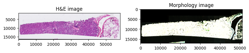
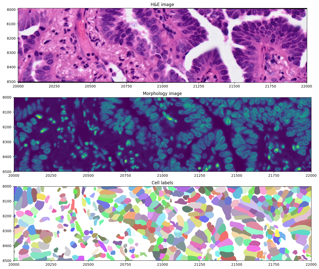
The datasets contains 2 large microscopy image, represented as a multiscale, chunked image; the first one, he_image is the H&E image of the tissue, stained post-Xenium measurement, and the morphology_focus image which consists of the image of the tissue used for the Xenium experiment.
Furthermore, it also contains label images, that are the segmentation masks of cells or nuclei (cell_labels and nucleus_labels respectively).
Plotting the images#
Let’s visualize the images.
import matplotlib.pyplot as plt

axes = plt.subplots(1, 2, figsize=(10, 10))[1].flatten()
sdata.pl.render_images("he_image").pl.show(ax=axes[0], title="H&E image")
sdata.pl.render_images("morphology_focus").pl.show(ax=axes[1], title="Morphology image")
INFO     Rasterizing image for faster rendering.
INFO     Rasterizing image for faster rendering.
INFO     Your image has 4 channels. Sampling categorical colors and using multichannel strategy 'stack' to render.
We can also crop and visualize a smaller region to appreciate morphological differences measured by the two modalities, together with the cell segmentation mask. Spatial cropping is introduced in a dedicated notebook in the documentation.
from spatialdata import bounding_box_query

axes = plt.subplots(3, 1, figsize=(20, 13))[1].flatten()


def crop0(x):
    return bounding_box_query(
        x,
        min_coordinate=[20_000, 8000],
        max_coordinate=[22_000, 8500],
        axes=("x", "y"),
        target_coordinate_system="global",
    )


crop0(sdata).pl.render_images("he_image").pl.show(ax=axes[0], title="H&E image", coordinate_systems="global")
crop0(sdata).pl.render_images("morphology_focus", channel="DAPI").pl.show(
    ax=axes[1], title="Morphology image", coordinate_systems="global", colorbar=False
)
crop0(sdata).pl.render_labels("cell_labels").pl.show(ax=axes[2], title="Cell labels", coordinate_systems="global")
Exploring the multimodal segmentation#
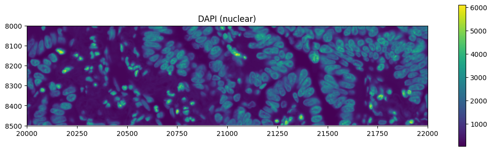
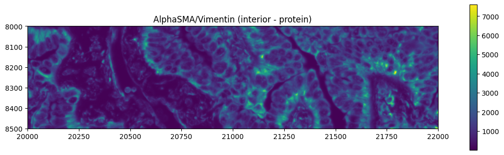
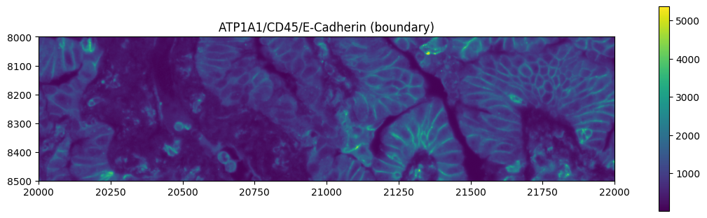
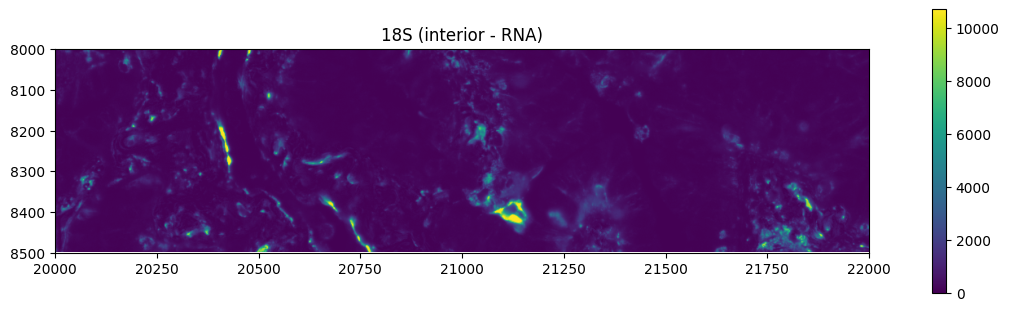
Let’s visualize the 4 channels that are used, for this dataset, for computing the cell segmentation. This is specific for datasets profiled using the Cell Segmentation Kit and processed with the Xenium Analyzer >= 2.0.0.
from spatialdata.models import get_channel_names

channel_names = get_channel_names(sdata["morphology_focus"])
channel_names
['DAPI', 'ATP1A1/CD45/E-Cadherin', '18S', 'AlphaSMA/Vimentin']
crop0(sdata).pl.render_images("morphology_focus", channel=channel_names[0]).pl.show(
    title="DAPI (nuclear)", figsize=(10, 3)
)
crop0(sdata).pl.render_images("morphology_focus", channel=channel_names[1]).pl.show(
    title="AlphaSMA/Vimentin (interior - protein)", figsize=(10, 3)
)
crop0(sdata).pl.render_images("morphology_focus", channel=channel_names[2]).pl.show(
    title="ATP1A1/CD45/E-Cadherin (boundary)", figsize=(10, 3)
)
crop0(sdata).pl.render_images("morphology_focus", channel=channel_names[3]).pl.show(
    title="18S (interior - RNA)", figsize=(10, 3)
)
Plotting the gene expression data#
With SpatialData we can also plot gene expression data on top of the images. We can plot the expression of a single gene, or the expression of multiple genes.
To showcase different functionalities, we will use the cell_circles Shapes element to overlay gene expression over the image, instead of the raster labels showed above.
Let’s first normalize and select highly variable genes.
import scanpy as sc

sc.pp.normalize_total(sdata.tables["table"])
sc.pp.log1p(sdata.tables["table"])
sc.pp.highly_variable_genes(sdata.tables["table"])
sdata.tables["table"].var.sort_values("means")
| gene_ids | feature_types | genome | highly_variable | means | dispersions | dispersions_norm | |
|---|---|---|---|---|---|---|---|
| UMOD | ENSG00000169344 | Gene Expression | Unknown | False | 0.000855 | 0.733388 | 0.142545 |
| LY6D | ENSG00000167656 | Gene Expression | Unknown | False | 0.001364 | 0.557849 | -0.404188 |
| SST | ENSG00000157005 | Gene Expression | Unknown | False | 0.001424 | 0.184340 | -1.567515 |
| TCF15 | ENSG00000125878 | Gene Expression | Unknown | False | 0.001587 | 0.189523 | -1.551373 |
| CCL27 | ENSG00000213927 | Gene Expression | Unknown | False | 0.001663 | 0.526737 | -0.501089 |
| ... | ... | ... | ... | ... | ... | ... | ... |
| CAPN8 | ENSG00000203697 | Gene Expression | Unknown | True | 0.859493 | 1.032884 | 1.000000 |
| EPCAM | ENSG00000119888 | Gene Expression | Unknown | False | 0.897788 | 0.938736 | -0.707107 |
| TCIM | ENSG00000176907 | Gene Expression | Unknown | True | 0.948361 | 1.136240 | 0.707107 |
| CYP2B6 | ENSG00000197408 | Gene Expression | Unknown | True | 0.989477 | 1.524039 | 1.000000 |
| MALL | ENSG00000144063 | Gene Expression | Unknown | True | 1.119610 | 1.181179 | 1.000000 |
377 rows × 7 columns
gene_name = "EPCAM"
crop0(sdata).pl.render_images("morphology_focus", channel="DAPI", cmap="gray").pl.render_shapes(
    "cell_circles",
    color=gene_name,
).pl.show(
    title=f"{gene_name} expression over Morphology image",
    coordinate_systems="global",
    figsize=(10, 3),
)

We can also assign the table to a different region, in order to overlay the gene expression for the specified region. SpatialData stores the information of which region is the table in the following places:
in
sdata.tables[<table_name>].uns["spatialdata_attrs]["region"]it stores the regions that the table is annotating.The name of the region is stored under
sdata.tables[<table_name>].obs["region_key"].
We can use a utility function to modify that information, and hence plot the gene expression for a different shapes.
sdata.tables["table"].obs["region"] = "cell_boundaries"
sdata.set_table_annotates_spatialelement("table", region="cell_boundaries")

crop0(sdata).pl.render_images("he_image").pl.render_shapes(
    "cell_boundaries",
    color=gene_name,
).pl.show(
    title=f"{gene_name} expression over H&E image",
    coordinate_systems="global",
    figsize=(10, 5),
)

Finally, we can also plot transcript locations, together with the same layers selected as before.
crop0(sdata).pl.render_images("he_image").pl.render_shapes(
    "cell_boundaries",
    color=gene_name,
).pl.render_points(
    "transcripts",
    color="feature_name",
    groups=gene_name,
    palette="orange",
).pl.show(
    title=f"{gene_name} expression over H&E image",
    coordinate_systems="global",
    figsize=(10, 5),
)
INFO input has more than 103 categories. Uniform 'grey' color will be used for all categories.
